Making a bar chart of county names with Incanter

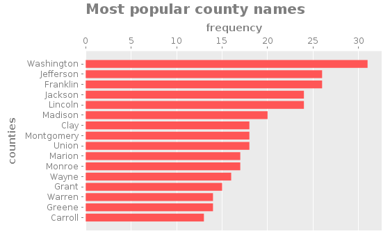
In our last installment, we used jsoup and Clojure to parse a list of county names. As it turns out, we can thank George Washington for giving birth to both the USA and the most frequent county name: Washington County!
As promised, our county counter now automatically builds a bar chart (or histogram) of the most frequent county names in America. For this I used Incanter, "a Clojure-based, R-like platform for statistical computing and graphics." Above, you can see the final result.
You can find all the code in this post on GitHub.
Finding the bar-chart library
Before I started working on this little project, I had no idea how I would use Clojure to generate a bar chart. Obviously I would use a third-party library for the job, but I didn't even know of any. I search for "clojure histogram." This led me to histogram by bigmlcom, which was not what I was looking for.
You'll also find the frequencies function in the search results, but I already know about this function: I want to visualize its output.
Later on in the results was Incanter. I saw their histogram function, but that seems suited for raw numerical data. But there is also the bar-chart function, which accepts two parameters: a list of categories and a list of corresponding values. Sounds like we found the man for the job.
Plotting the results
Armed with a function and data, we're ready to make a chart! Assuming d is our data from the frequencies function and n is the number of results to plot, this is how we can view the bar chart:
(let [data (take n(reverse (sort-by val d)))]
  (view (bar-chart (keys data) (vals data)))
We can turn this into a function that also saves the bar chart to a file:
(defn to-histogram [d n filename]
  (let [data (take n (reverse (sort-by val d)))
        plot (bar-chart (keys data) (vals data))]
    (save plot filename)
    (view plot)))
After modifying the main function to use this function, we can run our program with lein run to make a chart.

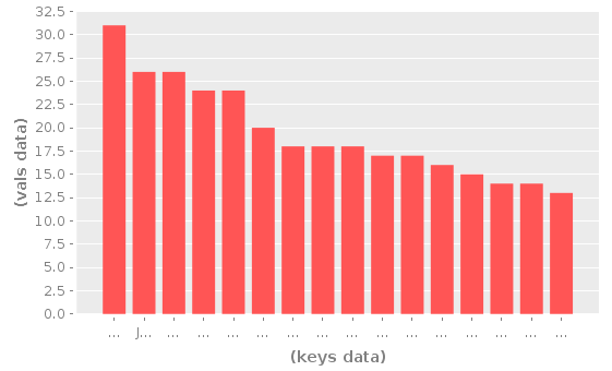
Uh, so, there are some problems. We can't see any of the county names and the labels are useless. Let's take a look at the bar-chart options: title, x-label, y-label, series-label, legend, vertical, and group-by. The title and label options clearly seem useful. And, hmm, maybe vertical will make more room for the county names?
Now our call to bar-chart looks as follows with the new options. We can also add :height and :width options to the save function.
(bar-chart (keys data) (vals data)
  :title "Most popular county names"
  :x-label "counties"
  :y-label "frequency"
  :vertical false)
There we have it! That's how the chart at the beginning of the post was made. Now we can actually see the county names. Also, the labels help to explain what's in the chart.
Get the code
The complete code for this post is on GitHub!